In the world of print publication, laying out a design starts with a canvas that has a known height and width. If an agency is putting together an advertisement for a magazine, and they know that they are (hypothetically) designing for a page that is 8 inches wide and 10 inches high, assuming a standard 300 dpi, a designer can start off by creating a 2400×3000 pixel canvas. That designer can then move on to laying out the advertisement with pixel-perfect accuracy knowing full well that the magazine stands very little chance of changing size or shape after it has been printed. If an image or a block of text needs to be moved to the left by 2 pixels, it is as simple as moving that element over 2 pixels.
The world of mobile development isn’t quite that cut and dry. When an app needs to work on multiple devices and multiple orientations, the variety of screen sizes on the market must to be taken into account. This is especially true for Android and cross-platform apps, where screen sizes and pixel densities vary greatly between devices. First, there’s the physical device resolution to consider. The iPhone 4 and 4S have a “Retina” display with a 480×960 resolution (so named because the pixel density is so high that individual pixels are impossible to see with the naked eye), older iPhones have a 320×480 resolution, the first and second generation iPads are 1024×768, the new iPad has a 2048×1536 retina display. Android device resolutions are all over the place. The Samsung Galaxy 10.1 has a 1280×800 display, and two Android phones we’ve been working with lately (the Sharp Aquos SHI13 and the Kyocera Digno ISW11K) have resolutions of 540×960 and 480×800 respectively. The new Windows 7 Nokia Lumia 900 is 480×800.
.png)
Additionally, for the mobile web and for “hybrid” applications built with HTML5/CSS3 using native wrappers like Phonegap, the UI for the application is rendered inside of a Webkit-based webview on iOS and Android and a IE-based webview on Windows Phone. Webviews are designed to support pinching and zooming on mobile devices, so there are actually a few different functional “resolutions” to consider.
For instance, the document layout size (document.documentElement.clientWidth, document.documentElement.clientHeight) and the Screen Size in CSS pixels (window.width, window.height).
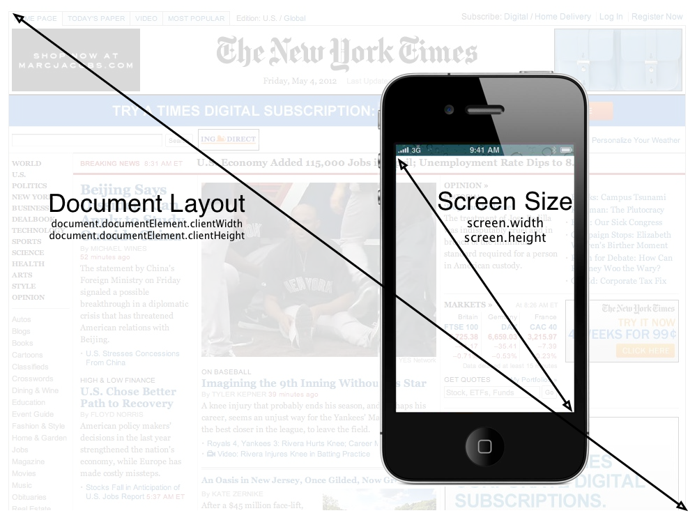
Taking the Zoom level into account, the portion of the document shown on the screen is the visual viewport (window.innerWidth, window.innerHeight). As you can see here, while the Document size and the Screen size remain the fixed, the viewport size changes as more and less document pixels are shown within the CSS pixels:
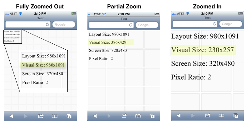
The reason for all these different resolutions is that when the iPhone was first developed, it had a physical resolution of 320×480 pixels, but Apple wanted users to be able to browse regular web sites as if they were sitting at a desktop computer with a much larger screen. They designed the iPhone to render pages in portrait mode as if the screen was 980 pixels wide. This causes it to initially render maximally zoomed out, and users then pinch and scroll around the page as if the phone were a small window to the larger website. By doing this, Apple decoupled the device resolution from the resolution of the CSS page being rendered in the browser. Google and other smart phone manufacturers followed suit. Even though the iPhone device resolution is 640px wide, the web view renders at 320×480 with a pixel ratio of 2 (2 device pixels for every 1 CSS pixel).
While the viewport concept is great for viewing web sites that were originally designed for desktop computers, mobile “hybrid” apps that use HTML5 technologies and mobile web sites are typically developed so that users do not have to (and frequently cannot) zoom and pan around the display. This effect is accomplished by locking the viewport size to the resolution reported by the device as the CSS screen size by using the “viewport” meta tag:
<meta name=“viewport”content=“width=device-width, initial-scale=1.0, maximum-scale=1.0, minimum-scale=1.0, user-scalable=0” />
This is what causes a hybrid or mobile web app to fill the screen, and allows the developer to place a fixed toolbar at the top, a fixed tab bar at the bottom. The end result is that the mobile web can look and function very much like a native app. You can see here in the “content” parameter, the width is set to equal the device width, at a zoom-level (scale) of 1, and the ability for the user to scale/zoom the viewport is disabled by setting “user-scalable” to 0. This special “viewport” meta tag was first introduced by Apple, and has been added to most other browsers, including the Android Webkit browser.
All of this brings us to the need for a fluid, adaptive layout, applying time-honored lessons from traditional web design and development so that the app adapts properly to multiple different screen sizes and ratios. As John Allsopp puts rather eloquently in his oft-referenced article, A Dao of Web Design, “If you are concerned about exactly how a web page appears this is a sign that you are still aren’t thinking about adaptive pages”.
Adaptive Layouts
Developing an adaptive layout for a hybrid mobile app is much the same as developing an adaptive website—after all the base technologies are the same. Instead of specifying sizes and locations in exact pixels, sizes are specified in terms of percentages of the element that contains them, and locations on the screen are specified in relation to other elements or the outer edges of the screen. Additionally, much like a native app, when viewed on different screen sizes, certain elements should scale and others shouldn’t. The tab bar, for instance, should scale horizontally to fill the screen, but should stay the same height regardless of the overall screen size so that more content is able to fill the page.
This makes it more difficult to place items exactly at a given location on a specific device, but it allows the app to resize fluidly on many different devices:
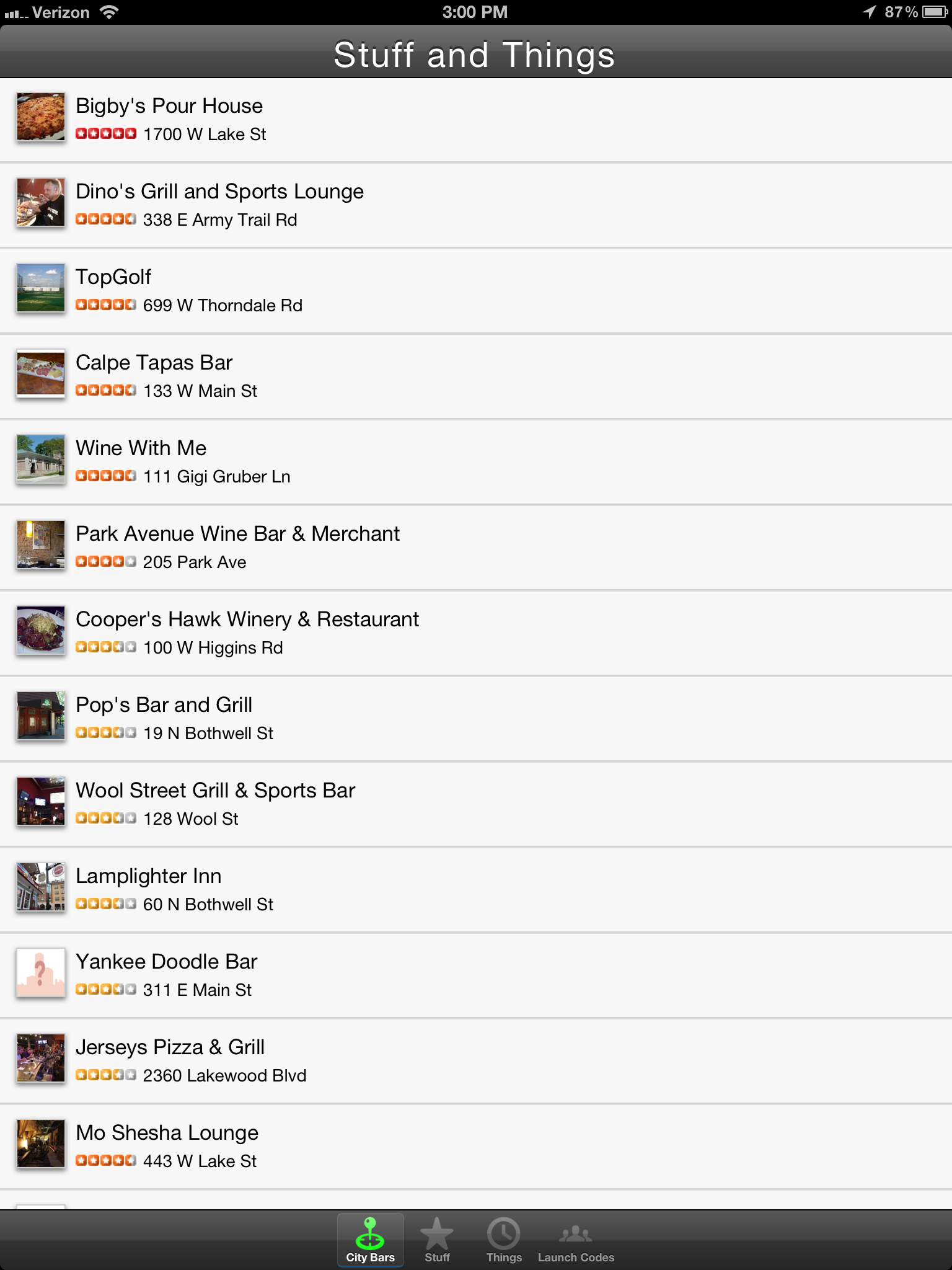
Also, while it would be wise to redesign the UI of the app somewhat for the tablet form factor, it even scales perfectly well all the way up to an iPad Retina display:
Taking it a Step Further — Responsive Design
But as the iPad example above makes evident, there’s a limit to what can be done by simply scaling items within the display. Scaling an app designed for a phone up to a tablet or desktop computer form factor does a poor job of using the extra screen real estate. For instance, on an iPad in landscape mode, it’s common to implement a Master/Detail view, where a list of data is presented on the left panel (master), and the detail about a selected item is displayed on the right (detail). This example that uses the Force.com Mobile Components to render Contact information in Salesforce.com shows the general idea:
That’s a pretty radical shift in how a view is rendered between a phone and a landscape tablet. Luckily, the HTML5 specification introduced the concept of Media Queries, which allow an HTML developer to specify different CSS style sheets depending on the resolution, orientation, aspect ratio, and even pixel density of the device that is rendering the page.
By specifying different style sheets for various types of devices, like phones, tablets, typical desktop computers, print, and massive displays, it’s possible to create a layout that adapts perfectly to the size of the device being used. I could provide some visual examples, but the MediaQueri.es site already does an excellent job of showing how this works, and the examples there illustrate the benefits quite well. As for how media queries are used, it’s as simple as specifying a media attribute in a <link> tag, and since stylesheets are additive, you can start “Mobile First”, and build your site up from the simplest design to more and more complex designs. That way the smallest devices will only download the CSS files and images meant for them, and other, larger devices can pull down the CSS files intended for them as well. For instance, this series of three CSS links starts by specifying a very basic style sheet that is intended for phones. Tablets in portrait orientation will render the first two CSS links, and desktop/latptop computers and landscape tablets will use the first three. It’s possible to continue this–for example–by specifying a stylesheet for extremely large displays, and a stylesheet for print.
<link href=“phones.css” rel=“stylesheet” media=“screen”>
<link href=“tablet-portrait.css” rel=“stylesheet” media=“screen and (min-device-width:480)”>
<link href=“desktop.css” rel=“stylesheet” media=“screen and (min-device-width:1024)”>
Further Reading
If you’re interested in learning more about responsive web design and media queries, these are some great resources:


 Read More
.png)