The 5 Biggest Problems with the Mobile Web
Remember when the iPhone first came out? One of the greatest things about it was that it was a phone that could browse the normal web. Not those awful WAP sites using Wireless Markup Language instead of HTML for feature phones, but the honest to goodness normal web. Users could pinch and scroll around the page as if the phone were a small window to the larger website. Was it perfect? No, not really. Flash didn’t work, text was tiny until you pinched in, and some sites rendered all wonky, but you could finally access most of the things on your phone that you could in a web browser on your computer.
But then people realized that the web UI should be different on mobile devices, and Apple introduced meta viewport settings to help out. Pages are easier to navigate on mobile devices when they have bigger buttons, the width of the page is fixed, and the text is set to a readable size by default. The new mobile web was born. Apps were launched and websites started detecting mobile user-agents. HTML5/CSS3 came out with Media Queries. When done well, this is all great stuff, but much of the time the current mobile web is ruined by well meaning companies trying to “go mobile” without knowing what they’re doing.
WE HAVE AN APP!
No, I don’t care if your forum has an app. I’m just browsing the web, or trying to Google the answer to something. I know absolutely nothing about your site yet, and if I was looking for an app, I’d be searching the app store. Even if you want to advertise your app, these popups aren’t even necessary anymore since Apple introduced Smart App Banners, which allow you to advertise your app with your website without being super intrusive about it. The same thing is possible on Android using JQuery.

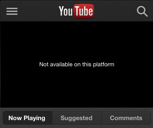
Video not available on mobile device
Really? I can’t watch a video of your cat using the people toilet on my phone? This video is so important–so sacred–that it must be viewed on a desktop computer, under natural lighting, in a room between 68 and 72 degrees, and must be preceded by a 30 second advertisement for toothpaste. This is why sites like Reddit are full of animated gifs, because YouTube and other video sites are so broken on mobile. It’s barely worth clicking on a video link because half the time it won’t work anyway.
Do you want the mobile site or the desktop site?
You’ve correctly identified that I’m on a mobile device. If you’ve bothered to create a mobile version of your website, why don’t you just show me that one? If you’re worried that I won’t like your mobile website, put a link at the bottom or something that lets me go back to the desktop version. Or make your mobile version better so people want to use it, but don’t make me choose before I’ve seen either version of your site. I’m not here to experience your site in all it’s different forms. I’m here to read some article I found a link to, or to look at a funny picture of a cat. Just get me to that cat as fast as you can, and I’ll be happy.

Impossible to close lightboxes
It tries to re-center itself every time you try to move the close button into view, but somehow it gets confused, and constantly moves the close button off the edge of the screen. These lightbox ads are bad enough on a computer, but when you have to fight with them to see the content behind it, it’s just not worth it. I’ll go read something else. The article probably wasn’t that great to begin with.
The “m-dot” URL
Here’s a tip — people share links. They email them, they Tweet them, they post them to Facebook, Reddit, StumbleUpon, LinkedIn, and Pinterest (whatever that is). They might be on a phone or a tablet, but who knows what everybody else is using. If I send an m-dot URL to someone on a computer, will they see the mobile site or the normal one? Depends on the site. Sometimes it goes one way, sometimes the other. Even worse is when you try to open a non m-dot URL on a mobile device and it just redirects to the site’s mobile homepage because there isn’t an m-dot equivalent for that URL. How about just making one link that works great on all devices? Sure, it can format the site differently based on the device or on the screen size, but why does it have to have it’s own special mobile URL?
So, those are my least favorite things about the mobile web, what are yours?
 Read More