Pages Menu
Categories Menu

Posted by on Nov 13, 2012 in Code, Mobile, The Cloud |

Windows 8 Development for Force.com – Part 1, OAuth 2.0

Windows 8 SFDC OAuth 2.0

This is the beginning of a multipart series on developing Windows 8 mobile apps for Salesforce.com with the user interface design language that was–until recently–referred to as Metro UI. Though the name is now Windows 8 UI, the typography-based design principles are the same, and you can read more about them in my April 30 blog post.

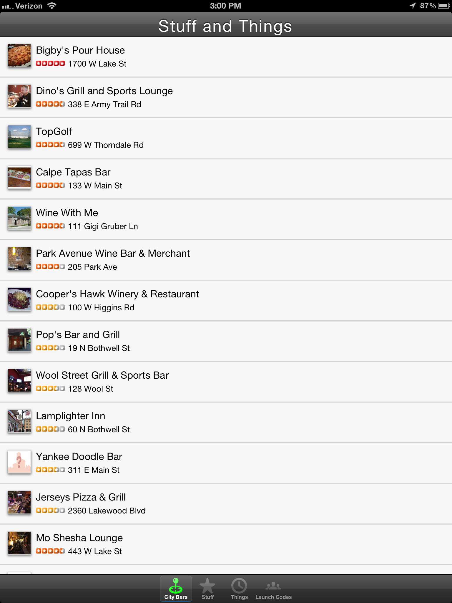
Over the course of this series, we’ll be developing a simple Chatter client for Windows 8 , shown below. The code for this is on GitHub, so feel free to follow along there. Part 1 covers how to log into Salesforce.com (or Database.com) and maintain a connection using OAuth 2.0, an industry-standard secure authentication mechanism. OAuth is the preferred mechanism for logging into SFDC from mobile or web apps, and if you haven’t seen it used in a business app before, you’ve almost certainly used it to log into a mobile app using your Facebook, Twitter, or LinkedIn credentials. One of the primary benefits of using OAuth in mobile apps is that the actual login dialog is hosted by the service provider, so the user never enters their username or password directly into the application itself. As you can see in the screenshot above, the actual login screen is shown within a webview, and carries the Salesforce.com branding so the user knows what service they’re logging into.

Chatter for Windows 8

Logging into Salesforce.com from a mobile app and maintaining that authentication so that the user doesn’t have to log in every time the session expires requires the implementation of two separate OAuth 2.0 flows. The User-Agent Flow handles the initial login to the app, and the Refresh-Token Flow handles refreshing the session key (the OAuth Access Token) whenever it expires. The expiration timeout value is configurable from within Salesforce setup to between 15 minutes and 12 hours.

Salesforce.com Setup

The first thing you’ll need before you begin on the mobile app is a Consumer Key and a Callback URL (also referred to as a Redirect URI) from your Salesforce org. For information on how to get these from Remote Access configuration, take a look at the Salesforce Configuration section of my OAuth 2.0 for Salesforce.com blog post.

User-Agent Flow

We’ll start out with the User-Agent flow to get an initial login to the app. To start, take a look at SFDCSession.cs in the GitHub repository. This class is a singleton that’s used to maintain session state throughout the app. Any class throughout the app can access the session information with the SFDCSession.Instance static accessor method. You’ll see the AccessToken and RefreshToken are defined as empty strings, and the ConsumerKey and RedirectUri are defined to match the remote access information in my SFDC developer org (you’ll just have to believe me on that one). The User-Agent flow is implemented using the oAuthUserAgentFlow() method in this class.

The first thing I’ve done in oAuthUserAgentFlow() is check to see if we already have an AccessToken. That way if the method gets called twice for some reason, or if a developer wants to hard-code an Access Token to speed up development, it will just skip over the rest of the method, and return the Access Token to the calling function.

Next, we check to see if we have a Refresh Token persisted in the encrypted PasswordVault from a previous run of the application. Since the Refresh Token can be used to generate Access Tokens to Salesforce.com, it’s important to treat it as secure data, and encrypt it accordingly. The RefreshToken getters and setters handle storing and retrieving the refresh token with vault.Retrieve() and vault.Add().

If we are able to retrieve a Refresh Token from the PasswordVault, then we can use the Refresh Token flow (which we’ll cover in a bit) to get a new Access Token.

One thing you’re seeing here that you may not be familiar with if you’re not already a C# programmer is the await keyword. To use await, you need to declare the method as async. This is a simple way to launch an asynchronous operation without blocking the UI thread. Since both the Access Token Flow and the Refresh Token Flow are network operations that call out to Salesforce.com endpoints, it’s necessary to use await in order to keep the application responsive to user interaction while the network operation is happening in the background.

If we don’t have a Refresh Token stored, this is either the first run of the application, or the user has previously logged out of their session, so we need to present the login dialog. Microsoft actually makes this fairly straightforward using WebAuthenticationBroker and some related classes. First, we need to define our request URI. This is the HTTP GET request that we send to Salesforce to request the login dialog be displayed to the user, and it comes in this format:

https://login.salesforce.com/services/oauth2/authorize?
response_type=token&
display=touch&
client_id=[CONSUMER KEY]
redirect_uri=[REDIRECT URI]

Into this, we plug our Consumer Key and WebUtility URLEncoded Redirect URI from our Salesforce.com Remote Access settings (or Connected Apps if you’re using that instead — as of the Winter 2013 release, Connected Apps is in Pilot release). We can then call the AuthenticateAsync method of WebAuthenticationBroker with our Request URI and our Callback URI. This returns an object of type WebAuthenticationResult. First we check to make sure the ResponseStatus is successful, and if it is ResponseData will contain the response URI from Salesforce.com containing our Access Token, Refresh Token, the Instance URL we should use for calls to the Force.com REST API, and some other information like the Org Id and the logged-in User’s Id. We save all of this information, and the RefreshToken setter stores that piece of important information in our PasswordVault. The Instance URL isn’t a secret, but it is useful to keep around, so we save it using the ApplicationData class, which gives us simple key/value storage that can be easily and automatically synchronized between Windows 8 systems.

At this point, we have authenticated, and we have all of the information needed to query the Force.com REST API or the Chatter REST API. We’ll get to how exactly we do that in Part 2 of this series. But first, we need to implement the Refresh Token Flow so that the app can reauthenticate behind the scenes when the Access Token expires.

Refresh Token Flow

Compared to the User-Agent Flow, the Refresh Token flow is pretty simple. It doesn’t require the user to do anything, so it can happen asynchronously behind the scenes whenever the app launches or if the REST API returns an HTTP 401 Unauthorized response to a query. The flow requires an HTTP POST request be sent to login.salesforce.com using these parameters:

Method: POST
URI: https://login.salesforce.com/services/oauth2/token
Parameters: grant_type=refresh_token&client_id=[CONSUMER KEY]&refresh_token=[REFRESH TOKEN]

If successful, the response from Salesforce returns a new Access Token and a new Instance URL. It’s possible — though unlikely — that your Salesforce.com org will have changed from one server instance (na1, na2, etc.) to another since the last login, so it’s a good idea to update both.

Refresh Token Flow

Anyway, that’s it. Be sure to check back for the next part in this series, where we’ll dig into querying the Chatter REST API, and showing the feed in the UI.

facebooktwittergoogle_plusredditpinterestlinkedinmail Read More

Posted by on Oct 17, 2012 in Code, The Cloud |

Big Data Made Small with Heroku, DynamoDB, and Elastic Map Reduce

Word Cloud
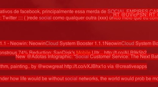
One million tweets per day.

An average of fifteen words per tweet.

Four (awesome) days of Dreamforce 2012…

Out of the 60 million words that scrolled across the screen on the Model Metrics Art of Code exhibit Moving the Cloud during Dreamforce 2012, which were the most frequently used? Well, “social” was #1, then “touch” and “mobile”. The word cloud above shows the rest of the top 100. But how did we calculate that? And, more importantly, how can we do so in a way that will easily scale up to working with much larger data sets?

Well, Moving the Cloud is written in Node.js, and I didn’t want to do anything that would tax the production version of the page, so the first thing I did was to create a simplified version of it by stripping out the UI/HTTP layer and adding in the Dynamo package for working with Amazon DynamoDB. DynamoDB is a highly performant, highly scaleable NoSQL database service hosted by Amazon Web Services. Amazon automatically handles scaling the storage space for you with super-fast SSD drives. Your main configuration options are to set the max number of allowed reads per second, and the max number of writes per second. Changing these values takes less than a minute, and you can set up CloudWatch alarms to let you know if you’re getting close to the limits. You pay more for higher limits, and we were seeing around 25-50 tweets per second max, so I set the write limit to 100. The read limit only really matters when you want to start reporting on the data, so I set it pretty low initially.

As you can see from the Trendy-Dynamo code in GitHub, the actual communication with DynamoDB from Node.js is pretty simple. DynamoDB stores Key/Value pairs, and has no defined schema aside from requiring a primary key. The Twitter Streaming API returns JSON documents with a lot of extra cruft, so I pulled out the relavent information and stored in in DynamoDB:

DynamoDB Explorer

Back in the olden days of aught four, I might have set this running on an old linux box laying around my house (I still actually have a few big towers stacked in the basement, along with boxes of power supplies and old parts, but they haven’t been turned on in ages). Then my ISP would drop the connection, or the power supply would fail, and I’d be missing a bunch of data. Enter Heroku. Such an app can literally be hosted for free on the Heroku Cedar Stack with one Worker Dyno:

Heroku Worker Dyno

Okay, so that’s the initial setup — let’s move ahead a few days — #DF12 is over, and we have 60 million words to count. This is where Elastic Map Reduce (EMR) comes in. EMR is a hosted instance of Apache Hadoop, and Map-Reduce is a handy algorithm for taking huge data sets and breaking them down into smaller, manageable chunks. Think of it like this — imagine in this image that each of the three multi-colored blocks on the left side is one individual tweet…

Map Reduce

Say the red block is the word “salesforce”, the yellow block is the word “is”, and the blue block is the word “social”. The first step of the process is to count the instances of each word in that tweet. Then, we increment the count of that word in every tweet. Simple, right? Over time, we break down 60 million words into a reduced set where each word occurs only once, but is accompanied by a number that represents the total number of occurrences. To do this with EMR, the first thing we need to do is to snapshot the data from DynamoDB into Amazon S3. To do this, I’ve used an interactive command line Hadoop tool named Apache Hive. It allows you to map external tables and to query them with SQL-like syntax.

Using Hive, I created an external table for DynamoDB:

CREATE EXTERNAL table dynamo_tweet (tweet_id string, tweet_text string)
STORED BY 'org.apache.hadoop.hive.dynamodb.DynamoDBStorageHandler'
TBLPROPERTIES ("dynamodb.table.name" = "df12tweet","dynamodb.column.mapping" = "tweet_id:Tweet ID,tweet_text:text");

And an external table for S3:

CREATE EXTERNAL TABLE s3_df12snapshot (tweet_id string, tweet_text string)
ROW FORMAT DELIMITED FIELDS TERMINATED BY ','
LOCATION 's3://mm-trendy-dynamo/demo_output/';

And then copy from one to the other:

INSERT OVERWRITE TABLE s3_df12snapshot
SELECT * FROM dynamo_tweet;

Snapshotting takes a little while, so go get a coffee or something… Don’t worry, I’ll wait.

…And, we’re back. Okay, so now we need to actually run the Map-Reduce job to count each word. Luckily, EMR gives us a sample application that does just that:

WordCount

Select the Word Count job, walk through the rest of the wizard, and let it start processing. The amount of time it takes is basically a factor of how many EC2 instances you throw at it, and the processing power of each. When it finishes, the output of the job will be stored in S3, and you can create another external table in Hive:

CREATE EXTERNAL TABLE s3_df12mapreduce (tweet_word string, tweet_count int)
ROW FORMAT DELIMITED FIELDS TERMINATED BY '\t'
LOCATION 's3://mm-trendy-dynamo/outputmapreduce/';

And then query it:

SELECT * FROM s3_df12mapreduce
WHERE LENGTH(tweet_word) > 4
ORDER BY tweet_count DESC
LIMIT 100;

What you do with this map/reduced data is then up to you, but if you’re interested in how I created the word cloud, I used this D3-Cloud Javascript Library

TL;DR: I made a wordcloud with some tweets.

facebooktwittergoogle_plusredditpinterestlinkedinmail Read More

Posted by on Jul 18, 2012 in Code, The Cloud |

Moving the Cloud — HTML5 and CSS3 on Node.js

ScreenshotMoving the Cloud is an experiment in using HTML5 and CSS3 technologies and Node.js. It was also an experiment on using Node.js on the Cedar stack in Heroku, but that didn’t quite work out as expected (more on that later). It’s also an Easter egg on the Model Metrics Homepage. Click on the animated 1s and 0s down in the bottom left corner of the screen to get to it.

And… if you want, fork the source over on GitHub. The readme.md file there gives some information on how to get it set up.

I was asked to put together a temporary (it’ll probably be around for a few months) artsy installation piece for the Art of Code section on modelmetrics.com. Going into the project, I wanted to do a social media visualization because, well, I think they’re cool. Some of my favorite examples are Twistori.com and Vizeddit — they visualize Twitter and Reddit respectively.

Moving the Cloud uses Node.js to pull tweets containing some keywords like “Cloud”, “Salesforce”, “Social”, “Mobile”, or “Model Metrics” from the Twitter Streaming API and stream them to clients using websockets. They move across the screen right to left, sort of like a cloud — GET IT? (nudge nudge wink wink)?

Twitter Streaming API

The Twitter Streaming API (well, technically APIs) allows you to open up a long-running socket connection with Twitter, and stream tweets that match a certain criteria. For this, I used the Public Stream API with the /filter endpoint so that I could receive tweets that matched my keywords. Technically, you could do this directly from the client using HTML5 websockets, but you have to authenticate with Twitter. You can generate keys for a specific app at dev.twitter.com, so you don’t have to just hard-code your Twitter username and password into the app, but still, you don’t really want to embed that in client-side code. So, in this example, I’m using Node.js as a go-between. It authenticates with Twitter, sets up a socket connection with the Streaming API, and dispatches those tweets out to any clients (browsers) that connect to it.

Node.js

If you haven’t used Node.js, you should. It’s a way to run Javascript on the server-side that takes advantage of Javascript’s inherent event-based non-blocking nature to create a server that works especially well for realtime or data-intensive apps like instant messaging apps. It’s possible to build a regular website (like a blog or something) with it using Express (which I am using here for simplicity), but I’m not sure it’s necessarily the best choice for something like that, as RoR, PHP, and Python (for instance) already do a pretty good job in that space. For a Twitter streaming API app, though, Node is great.

The Node.js server script itself is pretty simple–it uses the node-twitter library to connect to Twitter, and Socket.io to handle the setting up the websocket connections with whatever client browser happens to connect to it. It also handles fallback to XHR long polling for browsers that don’t support websockets. Aside from an array to hold active connections and some error handling, that’s about it on the server side.

HTML5/CSS3

Like I said earlier, one of my goals for this project was to demonstrate some HTML5 and CSS3 technologies. Because of that, it does not work on IE. It would probably be possible to get it sort of working in IE by falling back from HTML5/CSS3 technologies to older ones, but it wouldnt’ work as well, and sometimes you just have to leave the old crappy browsers behind. It does work perfectly fine on current versions of Chrome, Safari, Firefox, Mobile Safari (iPhone/iPad), and the Android Browser, though the transitions are kind of choppy on Firefox. Anyway, here’s some of what’s going on:

WebSockets

Websockets are awesome. If you’re familiar with client/server programming, you’re probably familiar with the concept of sockets. If you’re not, you use them all the time anyway. With a typical HTTP request, for instance, a socket connection is opened with the server, a request is made (GET, POST, etc.), a response is given and the socket is closed. In order for the server to be able to push data down to the client, a socket connection needs to stay open.

There’s some hacks like XHR Long Polling (Comet) that work on older browsers, basically by opening a dummy request socket and delaying the response until something push-worthy happens, but it’s limited by the HTTP 1.1 spec that says a browser should have no more than 2 open sockets with a server, and, well, it’s hacky. Websockets, on the other hand, let you open up a bi-directional full-duplex socket between a web browser and a server. In Moving The Cloud, tweets are sent from the Node.js server to the each client using websockets. Socket.io handily fails back to XHR long polling if websockets aren’t available.

CSS3 Transitions

CSS3 transitions allow you to do 2D and 3D transformations without using any Javascript. This is great because, for the most part, it’s faster to do things in CSS where possible. On some platforms, it’s even hardware accelerated. Webkit-based browsers even include a special mode that lets you see which elements are hardware accelerated. This is Safari’s CA_COLOR_OPAQUE=1 mode:

Screenshot

Show hardware acceleration in Safari CA_COLOR_OPAQUE=1

Show hardware acceleration in Chrome –show-composited-layer-borders

Firefox, best I can tell, does not have a similar mode. And CSS3 transitions are really slow in the current version of Firefox, too. So, I guess Mozilla has some work to do on that front.

In Moving the Cloud, I used the JQuery Transit plugin because it handles fallbacks to Javascript transitions when CSS3 transitions aren’t available.

CSS3 Web Fonts

Web Fonts use the @font-face rule to include font files that can be hosted on the web – they don’t have to be installed on the viewer’s computer. This has given rise to some great services like Google Web Fonts and fontsforweb.com. This is great, because the Model Metrics logo uses GothamLight, which isn’t a typical web font. In the olden-days, back when onions were worn on belts, logos that had to use a specific font would typically just be images, and the font for the rest of the site would just be a web-safe font that was close enough.

For instance, the rest of the modelmetrics.com site (except the logo) uses the Helvetica font family: “HelveticaNeue-Light”, “Helvetica Neue Light”, “Helvetica Neue”, Helvetica, Arial, “Lucida Grande”, sans-serif. My bit uses GothamLight:

@font-face{
font-family: "GothamLight";
src: url('http://fontsforweb.com/public/fonts/1151/GothamLight.eot');
src: local("Gotham-Light"), url('http://fontsforweb.com/public/fonts/1151/GothamLight.ttf') format("truetype");
}
.fontsforweb_fontid_1151 {
font-family: "GothamLight";
}

CSS3 Opacity

CSS3 adds an opacity parameter, so any element can a specified level of opacity (or what most people would call transparency). It’s pretty simple to use – just add an opacity: attribute to an HTML element, and specify a value. The footer in Moving the Cloud, for instance, has an opacity value of 0.9. Just enough so that you can see tweets floating by underneath.

HTML5 Boilerplate

When starting a new web app, it’s often a good idea to start with a reset.css to normalize your app across browsers. HTML5 Boilerplate gives you that and more. It’s is a “”professional front-end template that helps you build fast, robust, adaptable, and future-proof websites”. It’s a great starting point for an HTMl5 app that handles many of the idiosyncrasies between various browsers.

Known Issues

Moving the Cloud works quite well in most modern browsers, but there are some known issues:

Internet Explorer

Doesn’t work – right now I’m just using an [if IE] statement to show a message to the user that they should use a different browser – yes, I know this is bad form, but it’s not a critical portion of the website, and it’s meant to demonstrate new technologies not imitations of new technologies. Partially it doesn’t work because IE doesn’t support Websockets or CSS3 Transitions, but technically speaking, Socket.io should be able to fail back to XHR long polling, and JQuery Transit should be able to fail back to Javascript, so I’m not 100% sure why it isn’t working. I could spend some more time on it, but to be honest, even if I got it working, I’m assuming it will be really slow and crappy anyway.

Firefox

Speaking of which, it’s kind of slow and crappy on Firefox. I think this is just because CSS3 transitions are slow and crappy on Firefox. Mozilla really needs to step it up – it runs great on my iPhone but not Firefox on a new MacBook Pro.

Heroku

I really wanted to get this working in Heroku. Really really really did. And, technically it does work – on one dyno. I think the issue is that the Cedar stack doesn’t support websockets from Node.js, so it has to use XHR Long Polling, and even though it should work with a RedisStore as a man in the middle, it works sort of intermitently if you try to scale the app up to use more than one dyno. So, it’s running in EC2. I’ll try again when Cedar supports websockets. More information here on stackoverflow.com.

facebooktwittergoogle_plusredditpinterestlinkedinmail Read More

Posted by on Jun 28, 2012 in Code, Mobile, The Cloud, Videos |

Painless Mobile App Development Webinar

Gartner predicts that by 2015, mobile app projects will outnumber PC app projects 4-to-1. Learn how to quickly build and efficiently maintain native mobile apps that scale on-demand by powering them with cloud technology. We presented this webinar June 2012 on “Painless Mobile App Development”.

In this webinar, we went over these items:

  • Create a cloud database for your app, one that’s automatically scalable and configured for disaster recovery, all in a matter of minutes without ever leaving your browser
  • Build a native mobile app that leverages the database’s open standards-based APIs for authentication and data persistence
  • Code and use a custom REST API for your app to encapsulate unique business logic and improve the efficiency of your app’s performance
  • Securely store data offline to support situations when the app cannot access the cloud database
facebooktwittergoogle_plusredditpinterestlinkedinmail Read More

Posted by on Jun 4, 2012 in Code, Mobile |

Fluid Mobile HTML5 Design and Development

In the world of print publication, laying out a design starts with a canvas that has a known height and width. If an agency is putting together an advertisement for a magazine, and they know that they are (hypothetically) designing for a page that is 8 inches wide and 10 inches high, assuming a standard 300 dpi, a designer can start off by creating a 2400×3000 pixel canvas. That designer can then move on to laying out the advertisement with pixel-perfect accuracy knowing full well that the magazine stands very little chance of changing size or shape after it has been printed. If an image or a block of text needs to be moved to the left by 2 pixels, it is as simple as moving that element over 2 pixels.

The world of mobile development isn’t quite that cut and dry. When an app needs to work on multiple devices and multiple orientations, the variety of screen sizes on the market must to be taken into account. This is especially true for Android and cross-platform apps, where screen sizes and pixel densities vary greatly between devices. First, there’s the physical device resolution to consider. The iPhone 4 and 4S have a “Retina” display with a 480×960 resolution (so named because the pixel density is so high that individual pixels are impossible to see with the naked eye), older iPhones have a 320×480 resolution, the first and second generation iPads are 1024×768, the new iPad has a 2048×1536 retina display. Android device resolutions are all over the place. The Samsung Galaxy 10.1 has a 1280×800 display, and two Android phones we’ve been working with lately (the Sharp Aquos SHI13 and the Kyocera Digno ISW11K) have resolutions of 540×960 and 480×800 respectively. The new Windows 7 Nokia Lumia 900 is 480×800.

Additionally, for the mobile web and for “hybrid” applications built with HTML5/CSS3 using native wrappers like Phonegap, the UI for the application is rendered inside of a Webkit-based webview on iOS and Android and a IE-based webview on Windows Phone. Webviews are designed to support pinching and zooming on mobile devices, so there are actually a few different functional “resolutions” to consider.

For instance, the document layout size (document.documentElement.clientWidth, document.documentElement.clientHeight) and the Screen Size in CSS pixels (window.width, window.height).

Taking the Zoom level into account, the portion of the document shown on the screen is the visual viewport (window.innerWidth, window.innerHeight). As you can see here, while the Document size and the Screen size remain the fixed, the viewport size changes as more and less document pixels are shown within the CSS pixels:

The reason for all these different resolutions is that when the iPhone was first developed, it had a physical resolution of 320×480 pixels, but Apple wanted users to be able to browse regular web sites as if they were sitting at a desktop computer with a much larger screen. They designed the iPhone to render pages in portrait mode as if the screen was 980 pixels wide. This causes it to initially render maximally zoomed out, and users then pinch and scroll around the page as if the phone were a small window to the larger website. By doing this, Apple decoupled the device resolution from the resolution of the CSS page being rendered in the browser. Google and other smart phone manufacturers followed suit. Even though the iPhone device resolution is 640px wide, the web view renders at 320×480 with a pixel ratio of 2 (2 device pixels for every 1 CSS pixel).

While the viewport concept is great for viewing web sites that were originally designed for desktop computers, mobile “hybrid” apps that use HTML5 technologies and mobile web sites are typically developed so that users do not have to (and frequently cannot) zoom and pan around the display. This effect is accomplished by locking the viewport size to the resolution reported by the device as the CSS screen size by using the “viewport” meta tag:

<meta name=“viewport”content=“width=device-width, initial-scale=1.0, maximum-scale=1.0, minimum-scale=1.0, user-scalable=0” />

This is what causes a hybrid or mobile web app to fill the screen, and allows the developer to place a fixed toolbar at the top, a fixed tab bar at the bottom. The end result is that the mobile web can look and function very much like a native app. You can see here in the “content” parameter, the width is set to equal the device width, at a zoom-level (scale) of 1, and the ability for the user to scale/zoom the viewport is disabled by setting “user-scalable” to 0. This special “viewport” meta tag was first introduced by Apple, and has been added to most other browsers, including the Android Webkit browser.

All of this brings us to the need for a fluid, adaptive layout, applying time-honored lessons from traditional web design and development so that the app adapts properly to multiple different screen sizes and ratios. As John Allsopp puts rather eloquently in his oft-referenced article, A Dao of Web Design, “If you are concerned about exactly how a web page appears this is a sign that you are still aren’t thinking about adaptive pages”.

Adaptive Layouts

Developing an adaptive layout for a hybrid mobile app is much the same as developing an adaptive website—after all the base technologies are the same. Instead of specifying sizes and locations in exact pixels, sizes are specified in terms of percentages of the element that contains them, and locations on the screen are specified in relation to other elements or the outer edges of the screen. Additionally, much like a native app, when viewed on different screen sizes, certain elements should scale and others shouldn’t. The tab bar, for instance, should scale horizontally to fill the screen, but should stay the same height regardless of the overall screen size so that more content is able to fill the page.

This makes it more difficult to place items exactly at a given location on a specific device, but it allows the app to resize fluidly on many different devices:

Also, while it would be wise to redesign the UI of the app somewhat for the tablet form factor, it even scales perfectly well all the way up to an iPad Retina display:

Taking it a Step Further — Responsive Design

But as the iPad example above makes evident, there’s a limit to what can be done by simply scaling items within the display. Scaling an app designed for a phone up to a tablet or desktop computer form factor does a poor job of using the extra screen real estate. For instance, on an iPad in landscape mode, it’s common to implement a Master/Detail view, where a list of data is presented on the left panel (master), and the detail about a selected item is displayed on the right (detail). This example that uses the Force.com Mobile Components to render Contact information in Salesforce.com shows the general idea:

That’s a pretty radical shift in how a view is rendered between a phone and a landscape tablet. Luckily, the HTML5 specification introduced the concept of Media Queries, which allow an HTML developer to specify different CSS style sheets depending on the resolution, orientation, aspect ratio, and even pixel density of the device that is rendering the page.

By specifying different style sheets for various types of devices, like phones, tablets, typical desktop computers, print, and massive displays, it’s possible to create a layout that adapts perfectly to the size of the device being used. I could provide some visual examples, but the MediaQueri.es site already does an excellent job of showing how this works, and the examples there illustrate the benefits quite well. As for how media queries are used, it’s as simple as specifying a media attribute in a <link> tag, and since stylesheets are additive, you can start “Mobile First”, and build your site up from the simplest design to more and more complex designs. That way the smallest devices will only download the CSS files and images meant for them, and other, larger devices can pull down the CSS files intended for them as well. For instance, this series of three CSS links starts by specifying a very basic style sheet that is intended for phones. Tablets in portrait orientation will render the first two CSS links, and desktop/latptop computers and landscape tablets will use the first three. It’s possible to continue this–for example–by specifying a stylesheet for extremely large displays, and a stylesheet for print.

<link href=“phones.css” rel=“stylesheet” media=“screen”>
<link href=“tablet-portrait.css” rel=“stylesheet” media=“screen and (min-device-width:480)”>
<link href=“desktop.css” rel=“stylesheet” media=“screen and (min-device-width:1024)”>

Further Reading

If you’re interested in learning more about responsive web design and media queries, these are some great resources:

facebooktwittergoogle_plusredditpinterestlinkedinmail Read More

Posted by on May 17, 2012 in Code, Mobile |

Codesign: Re-Signing an IPA between Apple accounts

Since much of the iOS development work we do is for clients who are developing apps to distribute internally with an In House Mobile Provisioning Profile using their Enterprise Distribution Certificates, and not all of them want to share those files outside of their organization, we frequently need a way to send them the IPA file built with our own Apple account, and have them re-sign it to use their own.

This process can also be used, for instance, to test the final App Store Distribution build before sending it to iTunes Connect by resigning a copy of it from an App Store Distribution profile to an Ad Hoc one or to update an .ipa file from an In House profile with a certificate that is about to expire (they expire every year) to a new one without having to rebuild the app from the source.

Licensing Restrictions

If you’re doing this in order to send an app to a client, the first thing to note is that you want to use an Ad Hoc profile on your own account, not an In House profile. On the subject of customers, the license agreement for Enterprise Distribution states that you can:

Allow Your Customers to use Your Internal Use Applications, but only (i) on Your physical premises, or (ii) in other locations, provided all such use is under the direct supervision and physical control of Your Employees (e.g., a sales presentation to a Customer). 

So, sending your client an .ipa signed with your In House provisioning profile is verboten. However, the rules for Ad Hoc distribution are more lax in that they allow for distribution to individuals “who are otherwise affiliated with you”:

Subject to the terms and conditions of this Agreement, You may also distribute Your Applications to individuals within Your company, organization, educational institution, group, or who are otherwise affiliated with You for use solely on a limited number of Registered Devices (as specified on the Program web portal)

Also, it’s just easier to know that you’ve re-signed it correctly if you know that you’re starting with an Ad Hoc profile, since the app will only be able to be installed on the devices specified in your provisioning portal.

Bundle Id

This whole re-signing process will only work if the Bundle Id is the same for both profiles. So, the first thing you’ll need to do is find out what your client wants to use for the bundle id for the app. Let’s say our client, Tom’s Things, wants to use com.tomsthings.bestappever for a bundle id. To set that up, you’ll just need to set up that new bundle id in your provisioning portal (I’m using a wildcard ID here):

Then, you need to set up a new Ad Hoc profile using that bundle id and your distribution certificate, and you’ll probably also want to include a few of your client’s device UDIDs on it, so they’re able to test the app without having to re-sign it every time you send them a build.

Codesign: Re-signing the App

Now comes the fun part (for certain definitions of fun): taking the .ipa file and re-signing it to use a different account’s distribution certificate and profile. Since you’ll need the destination certificate and profile, in the example given above, this would be done by someone at Tom’s Things to use their own Enterprise Certificate and In House mobile provisioning profile. You’ll need to do all of this from the command line, so open up Terminal.app and navigate to the location of your .ipa file. The command line commands are shown here in blue.

  • Step 1: Unzip the IPA file (they’re just zip files renamed to .ipa). This will leave you with a folder named “Payload”.

unzip BestAppEver_adhoc.ipa

  • Step 2: Delete the _CodeSignature from within the .app bundle.

rm -rf Payload/BestAppEver.app/_CodeSignature

  • Step 3: Replace the embedded.mobileprovision file with your In House .mobileprovision profile.

cp ~/Documents/TomsThingsInHouse.mobileprovision Payload/BestAppEver.app/embedded.mobileprovision

  • Step 4: Use codesign to replace the existing signature using a certificate in your keychain to sign the app. In this example, I would need to have a certificate named “iPhone Distribution: Tom’s Things, Inc.” in my keychain. When you run this command, you’ll be asked to allow codesign to access this certificate. Choose to “Allow” or “Always Allow”.

/usr/bin/codesign -f -s “iPhone Distribution: Tom’s Things, Inc.” ––resource-rules Payload/BestAppEver.app/ResourceRules.plist Payload/BestAppEver.app

  • Step 5: You’re almost done. The last thing you need to do is to zip that Payload folder back into an .ipa file. Do do that, just use the zip command.

zip -r BestAppEver_inhouse.ipa Payload

And that’s it. Now you have an .ipa file signed with your certificate and mobile provisioning profile, ready to be uploaded to your internal app store or sent to your team for testing.

facebooktwittergoogle_plusredditpinterestlinkedinmail Read More