Tom Gersic on SmartStore
 Read More
In the world of print publication, laying out a design starts with a canvas that has a known height and width. If an agency is putting together an advertisement for a magazine, and they know that they are (hypothetically) designing for a page that is 8 inches wide and 10 inches high, assuming a standard 300 dpi, a designer can start off by creating a 2400×3000 pixel canvas. That designer can then move on to laying out the advertisement with pixel-perfect accuracy knowing full well that the magazine stands very little chance of changing size or shape after it has been printed. If an image or a block of text needs to be moved to the left by 2 pixels, it is as simple as moving that element over 2 pixels.
The world of mobile development isn’t quite that cut and dry. When an app needs to work on multiple devices and multiple orientations, the variety of screen sizes on the market must to be taken into account. This is especially true for Android and cross-platform apps, where screen sizes and pixel densities vary greatly between devices. First, there’s the physical device resolution to consider. The iPhone 4 and 4S have a “Retina” display with a 480×960 resolution (so named because the pixel density is so high that individual pixels are impossible to see with the naked eye), older iPhones have a 320×480 resolution, the first and second generation iPads are 1024×768, the new iPad has a 2048×1536 retina display. Android device resolutions are all over the place. The Samsung Galaxy 10.1 has a 1280×800 display, and two Android phones we’ve been working with lately (the Sharp Aquos SHI13 and the Kyocera Digno ISW11K) have resolutions of 540×960 and 480×800 respectively. The new Windows 7 Nokia Lumia 900 is 480×800.
.png)
Additionally, for the mobile web and for “hybrid” applications built with HTML5/CSS3 using native wrappers like Phonegap, the UI for the application is rendered inside of a Webkit-based webview on iOS and Android and a IE-based webview on Windows Phone. Webviews are designed to support pinching and zooming on mobile devices, so there are actually a few different functional “resolutions” to consider.
For instance, the document layout size (document.documentElement.clientWidth, document.documentElement.clientHeight) and the Screen Size in CSS pixels (window.width, window.height).
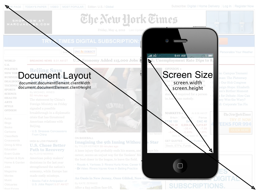
Taking the Zoom level into account, the portion of the document shown on the screen is the visual viewport (window.innerWidth, window.innerHeight). As you can see here, while the Document size and the Screen size remain the fixed, the viewport size changes as more and less document pixels are shown within the CSS pixels:
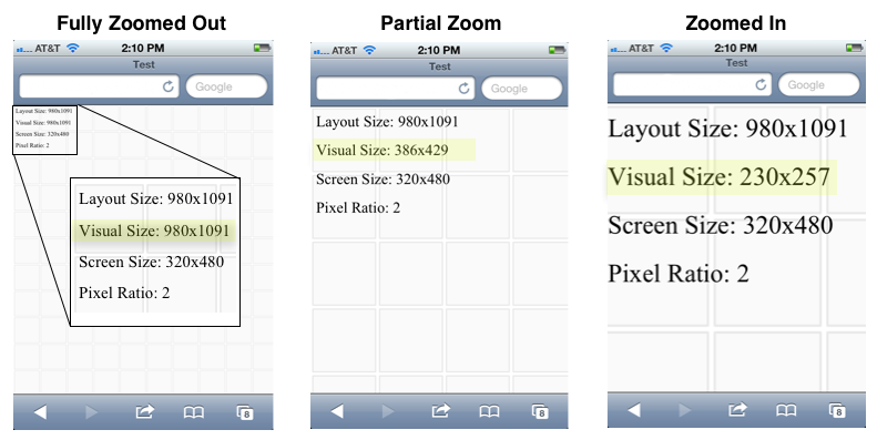
The reason for all these different resolutions is that when the iPhone was first developed, it had a physical resolution of 320×480 pixels, but Apple wanted users to be able to browse regular web sites as if they were sitting at a desktop computer with a much larger screen. They designed the iPhone to render pages in portrait mode as if the screen was 980 pixels wide. This causes it to initially render maximally zoomed out, and users then pinch and scroll around the page as if the phone were a small window to the larger website. By doing this, Apple decoupled the device resolution from the resolution of the CSS page being rendered in the browser. Google and other smart phone manufacturers followed suit. Even though the iPhone device resolution is 640px wide, the web view renders at 320×480 with a pixel ratio of 2 (2 device pixels for every 1 CSS pixel).
While the viewport concept is great for viewing web sites that were originally designed for desktop computers, mobile “hybrid” apps that use HTML5 technologies and mobile web sites are typically developed so that users do not have to (and frequently cannot) zoom and pan around the display. This effect is accomplished by locking the viewport size to the resolution reported by the device as the CSS screen size by using the “viewport” meta tag:
<meta name=“viewport”content=“width=device-width, initial-scale=1.0, maximum-scale=1.0, minimum-scale=1.0, user-scalable=0” />
This is what causes a hybrid or mobile web app to fill the screen, and allows the developer to place a fixed toolbar at the top, a fixed tab bar at the bottom. The end result is that the mobile web can look and function very much like a native app. You can see here in the “content” parameter, the width is set to equal the device width, at a zoom-level (scale) of 1, and the ability for the user to scale/zoom the viewport is disabled by setting “user-scalable” to 0. This special “viewport” meta tag was first introduced by Apple, and has been added to most other browsers, including the Android Webkit browser.
All of this brings us to the need for a fluid, adaptive layout, applying time-honored lessons from traditional web design and development so that the app adapts properly to multiple different screen sizes and ratios. As John Allsopp puts rather eloquently in his oft-referenced article, A Dao of Web Design, “If you are concerned about exactly how a web page appears this is a sign that you are still aren’t thinking about adaptive pages”.
Adaptive Layouts
Developing an adaptive layout for a hybrid mobile app is much the same as developing an adaptive website—after all the base technologies are the same. Instead of specifying sizes and locations in exact pixels, sizes are specified in terms of percentages of the element that contains them, and locations on the screen are specified in relation to other elements or the outer edges of the screen. Additionally, much like a native app, when viewed on different screen sizes, certain elements should scale and others shouldn’t. The tab bar, for instance, should scale horizontally to fill the screen, but should stay the same height regardless of the overall screen size so that more content is able to fill the page.
This makes it more difficult to place items exactly at a given location on a specific device, but it allows the app to resize fluidly on many different devices:
.png)
Also, while it would be wise to redesign the UI of the app somewhat for the tablet form factor, it even scales perfectly well all the way up to an iPad Retina display:
Taking it a Step Further — Responsive Design
But as the iPad example above makes evident, there’s a limit to what can be done by simply scaling items within the display. Scaling an app designed for a phone up to a tablet or desktop computer form factor does a poor job of using the extra screen real estate. For instance, on an iPad in landscape mode, it’s common to implement a Master/Detail view, where a list of data is presented on the left panel (master), and the detail about a selected item is displayed on the right (detail). This example that uses the Force.com Mobile Components to render Contact information in Salesforce.com shows the general idea:
That’s a pretty radical shift in how a view is rendered between a phone and a landscape tablet. Luckily, the HTML5 specification introduced the concept of Media Queries, which allow an HTML developer to specify different CSS style sheets depending on the resolution, orientation, aspect ratio, and even pixel density of the device that is rendering the page.
By specifying different style sheets for various types of devices, like phones, tablets, typical desktop computers, print, and massive displays, it’s possible to create a layout that adapts perfectly to the size of the device being used. I could provide some visual examples, but the MediaQueri.es site already does an excellent job of showing how this works, and the examples there illustrate the benefits quite well. As for how media queries are used, it’s as simple as specifying a media attribute in a <link> tag, and since stylesheets are additive, you can start “Mobile First”, and build your site up from the simplest design to more and more complex designs. That way the smallest devices will only download the CSS files and images meant for them, and other, larger devices can pull down the CSS files intended for them as well. For instance, this series of three CSS links starts by specifying a very basic style sheet that is intended for phones. Tablets in portrait orientation will render the first two CSS links, and desktop/latptop computers and landscape tablets will use the first three. It’s possible to continue this–for example–by specifying a stylesheet for extremely large displays, and a stylesheet for print.
Further Reading
If you’re interested in learning more about responsive web design and media queries, these are some great resources:
 Read More
Since much of the iOS development work we do is for clients who are developing apps to distribute internally with an In House Mobile Provisioning Profile using their Enterprise Distribution Certificates, and not all of them want to share those files outside of their organization, we frequently need a way to send them the IPA file built with our own Apple account, and have them re-sign it to use their own.
This process can also be used, for instance, to test the final App Store Distribution build before sending it to iTunes Connect by resigning a copy of it from an App Store Distribution profile to an Ad Hoc one or to update an .ipa file from an In House profile with a certificate that is about to expire (they expire every year) to a new one without having to rebuild the app from the source.
Licensing Restrictions
If you’re doing this in order to send an app to a client, the first thing to note is that you want to use an Ad Hoc profile on your own account, not an In House profile. On the subject of customers, the license agreement for Enterprise Distribution states that you can:
Allow Your Customers to use Your Internal Use Applications, but only (i) on Your physical premises, or (ii) in other locations, provided all such use is under the direct supervision and physical control of Your Employees (e.g., a sales presentation to a Customer).
So, sending your client an .ipa signed with your In House provisioning profile is verboten. However, the rules for Ad Hoc distribution are more lax in that they allow for distribution to individuals “who are otherwise affiliated with you”:
Subject to the terms and conditions of this Agreement, You may also distribute Your Applications to individuals within Your company, organization, educational institution, group, or who are otherwise affiliated with You for use solely on a limited number of Registered Devices (as specified on the Program web portal)
Also, it’s just easier to know that you’ve re-signed it correctly if you know that you’re starting with an Ad Hoc profile, since the app will only be able to be installed on the devices specified in your provisioning portal.
Bundle Id
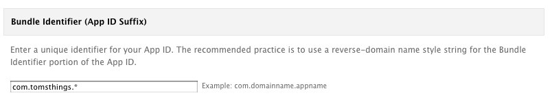
This whole re-signing process will only work if the Bundle Id is the same for both profiles. So, the first thing you’ll need to do is find out what your client wants to use for the bundle id for the app. Let’s say our client, Tom’s Things, wants to use com.tomsthings.bestappever for a bundle id. To set that up, you’ll just need to set up that new bundle id in your provisioning portal (I’m using a wildcard ID here):
Then, you need to set up a new Ad Hoc profile using that bundle id and your distribution certificate, and you’ll probably also want to include a few of your client’s device UDIDs on it, so they’re able to test the app without having to re-sign it every time you send them a build.
Codesign: Re-signing the App
Now comes the fun part (for certain definitions of fun): taking the .ipa file and re-signing it to use a different account’s distribution certificate and profile. Since you’ll need the destination certificate and profile, in the example given above, this would be done by someone at Tom’s Things to use their own Enterprise Certificate and In House mobile provisioning profile. You’ll need to do all of this from the command line, so open up Terminal.app and navigate to the location of your .ipa file. The command line commands are shown here in blue.
unzip BestAppEver_adhoc.ipa
rm -rf Payload/BestAppEver.app/_CodeSignature
cp ~/Documents/TomsThingsInHouse.mobileprovision Payload/BestAppEver.app/embedded.mobileprovision
/usr/bin/codesign -f -s “iPhone Distribution: Tom’s Things, Inc.” ––resource-rules Payload/BestAppEver.app/ResourceRules.plist Payload/BestAppEver.app
zip -r BestAppEver_inhouse.ipa Payload
And that’s it. Now you have an .ipa file signed with your certificate and mobile provisioning profile, ready to be uploaded to your internal app store or sent to your team for testing.
 Read More
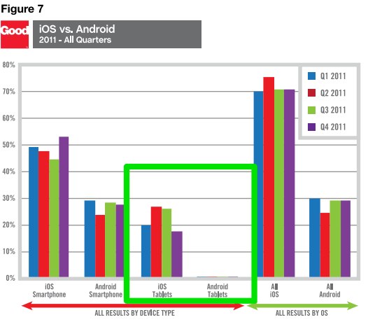
Metro is the UI (“design language”) that originated with Windows Phone 7, and is a big part of Windows 8 as Microsoft prepares to challenge Apple and Google in the tablet market. In the consumer market, the Kindle Fire has gobbled up over 50% of the Android tablet market share, which is hovering around 50% of the overall tablet market, but if you’re interested in the enterprise space at all, second place in that market behind the iPad is wide open territory:
Android has been plagued in the enterprise space by the security concerns of Gingerbread (Encryption? What’s that?), lackluster adoption of the more secure Ice Cream Sandwich (ICS) by device manufacturers, and nervousness over fragmentation. iPad has done exceptionally well, with built-in security features that rival the most hardened laptop, but knowing corporate IT’s preferences for Microsoft products, Windows 8 tablets could easily be poised to trounce Android and even challenge Apple in the years ahead.
At the same time, users want apps, and developers want users. Microsoft seems to have recognized that in order to grow the user base, they need more apps being developed, and there aren’t enough users around yet to entice the development community, so Microsoft is paying developers between $60k and $600k to develop for the Microsoft Store that, at 70k apps is lagging behind Android’s roughly 400k apps and Apple’s 600k apps. So, now’s a good time to work on a Windows Metro app.
Metro Design Principles
One of the nicest things about Metro is that Microsoft seems to have taken a cue from Apple’s book (the venerable iOS HIG), and have put some real thought into the UI and these design principles:
Content Before Chrome
Chrome is basically all of the stuff in your app that isn’t content. The toolbars, the tabs, button gradients, scrollbars, etc. One of the core concepts in Metro is to de-emphasize the app chrome and to use the size, weight, and color of typography to convey hierarchical information on the page. Looking at some popular apps, the difference is pretty easy to see in the lack of tab-bars, toolbars, and other application chrome elements. This is Spotify:
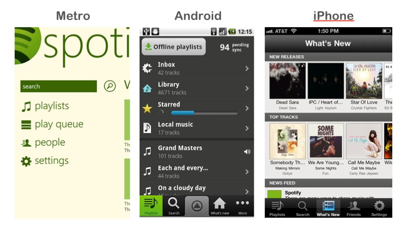
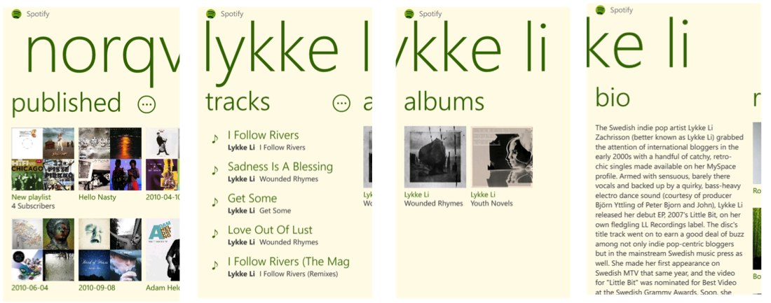
Apps are designed to flow from one screen to another instead of having tabs, as is you can see in these Spotify screenshots:
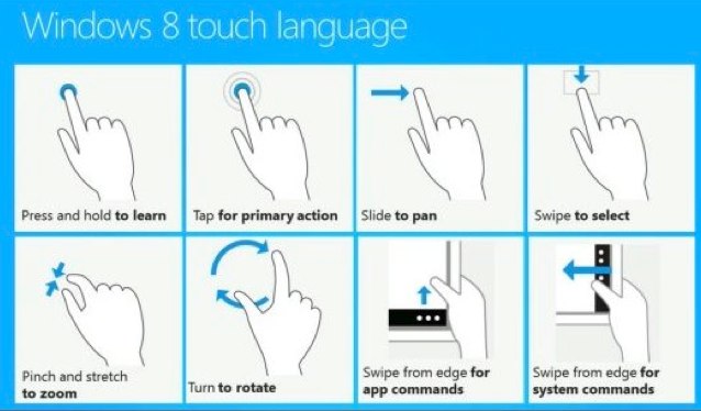
Be Fast and Fluid — Touch First
As with most tablet interfaces, touch gestures are important. Most of these are similar to iOS and Android, but Windows 8 has defined a few new ones, with app commands and system commands being shown in hidden toolbars on the bottom and right edge of the screen.
Be Fast and Fluid — Use Animation Library to Illustrate Common Scenarios
Again, nothing too groundbreaking here, except there are a number of nice animations built into the stock components. Some of them are demonstrated in these demo projects that are worth a look:
Snap and Scale Beautifully
Since Windows 8 apps will run on phones, tablets, netbooks, notebooks, and 30” displays, it makes sense to display more information on larger screen sizes rather than just making things bigger. Just like with the Mobile Web, native apps should handle different screen sizes elegantly, and adapt accordingly.
Snapping is an interesting feature that allows multiple apps to be shown on the screen at the same time. Since Metro isn’t really windowed, this is a way to keep your app on-screen in a sidebar while someone is off doing something else. For instance, if you wanted to monitor Twitter while browsing the maps application:
Use the Right Contracts
Contracts control how Metro apps interact with each other and with the OS.
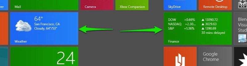
Invest in a Great Tile
Tiles are the icons of Windows Metro. Their real power lies in the ability to use the Microsoft Push Notification Server to push out content updates to Live Tiles. Personalized, regionalized, and/or customized content helps keep users coming back to your app.
Roam to the Cloud
Similar to Apple iCloud and Google Drive, Metro apps get per-user cloud storage for saving state to allow users to continue tasks across devices.
Developing Windows 8
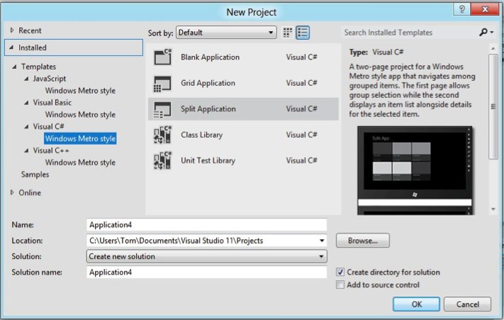
Getting started is easy and free. Just download the Windows 8 Consumer Preview and Visual Studio 11 Express Beta. Both can be installed in a VM, on a desktop/laptop, or on an actual tablet. From there, you basically just choose a template to start with. Your choices are Javascript, VB or C# .net, and C++ (mostly useful for DirectX games).
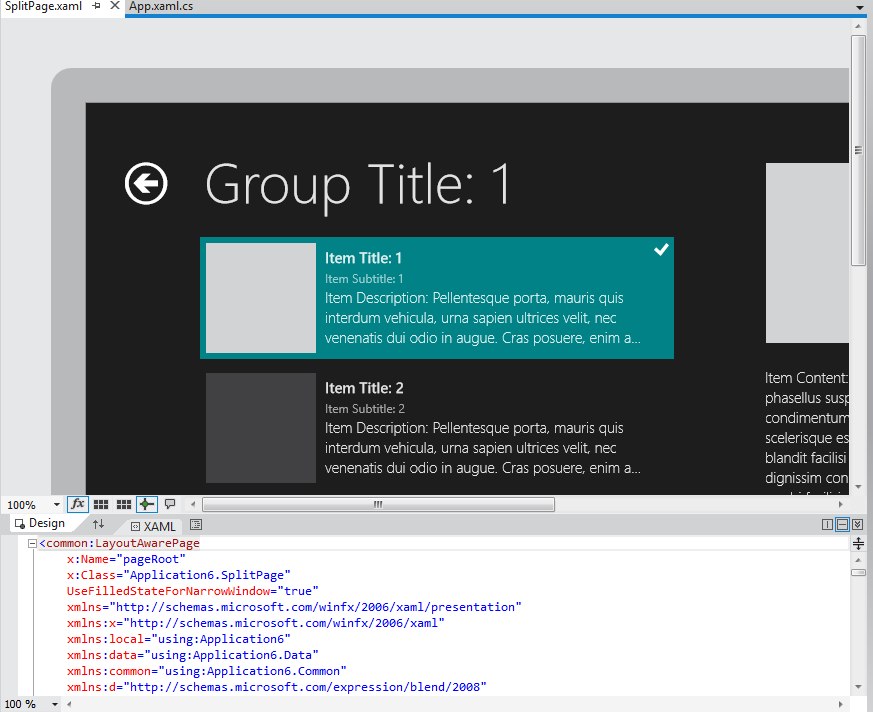
The Native options give you a handy XAML (eXtensible Application Markup Language) visual designer:
The Javascript templates, though, are really interesting because they give you the ability to create an app entirely in HTML5/Javascript, similar to what you would do on other platforms with PhoneGap/Cordova, but without the need for any external libraries.
So, that’s Metro. What are you doing with it?
 Read More
Storing Data Offline with Salesforce Mobile SDK SmartStore
Say you’re writing a “hybrid” mobile app for iOS and Android using PhoneGap (“Callback” or “Cordova”) and you want to store data locally. Your choices are kind of limited. You could, for instance, use WebSQL, which has been implemented in WebKit for a while now and is available on both iOS and Android devices. If you clicked that link, though, you’ll probably notice the big scary warning that WebSQL has been deprecated…

It works right now, but maybe it’s not the best idea to use it if you don’t want to have to strip it out someday down the road. You also have to deal with all the data size limitations and requests to the user to allow the app to increase the database size.
So, what’s up next from the W3C if the WebSQL spec isn’t being maintained? The new spec is IndexedDB, which is a “database of records holding simple values and hierarchical objects”. Perfect! We’ll just check caniuse.com to make sure it’s supported on iOS and Android:
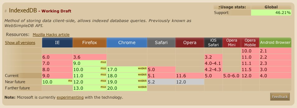
So… okay. It looks like it’s not supported yet on either. Does PhoneGap provide anything? In fact, it does, the Storage class. Which is based on WebSQL… I think you can see where I’m going here.
What do you do? Well, the Salesforce Mobile SDK for iOS and Android has implemented an ORM layer called SmartStore abstraction to SQLite, which uses FMDB on iOS and SQLCipher on Android. It’s easy to use and allows you to store data in JSON format locally and specify indexes for searching and sorting. Also, it uses native implementations of SQLite which are accessed via PhoneGap plugins so you don’t have any issues with HTML5 storage limitations or the W3C changing their mind about what web database technology everyone should standardize on.
To demonstrate SmartStore, I’ve put together a simple demo app, and posted it to Github:
https://github.com/tomgersic/SmartStoreDemo
The Sample App
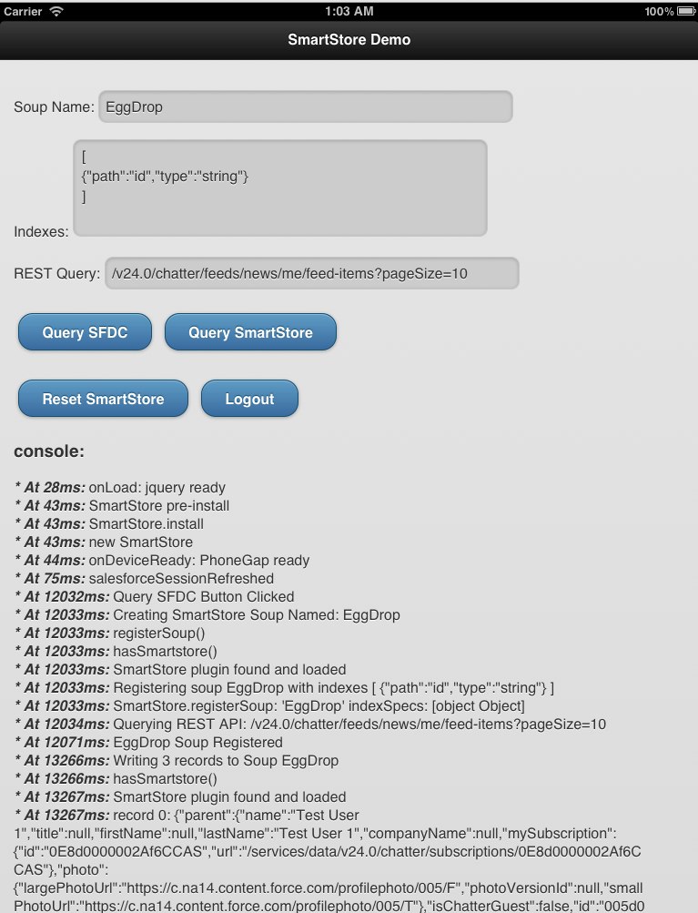
Here it is running on the iPad simulator. One thing to know about SmartStore is that each database Table is called a Soup. It’s an Apple Newton thing. The Newton’s file system was based on a “Soup” store model. So here, I’ve asked the app to create a new Soup named “EggDrop” specified that I want to use just the “id” field as an index, and entered a Salesforce REST API query to be executed using the handy ForceTK library.
To start off, download the code from GitHub and open up the XCode project. If you want to start from scratch, you’ll want to install the Salesforce Mobile SDK for iOS and selected “Hybrid Force.com App” from X-Code’s New Project wizard.
Going from top to bottom:
SmartStore Soup Functions
To see how all this works, the interesting bits are in the inline.js file.
navigator.smartstore.registerSoup(soupName,indexes,success,error);
navigator.smartstore.upsertSoupEntries(soupName,records, success, error);
var querySpec = navigator.smartstore.buildAllQuerySpec(“id”, null, 20);
This querySpec specifies “id’ as an index, null (allow default) for the sort order, and 20 for the page size.
navigator.smartstore.querySoup(soupName,querySpec, success(cursor),logError);
navigator.smartstore.removeSoup(record,success,error);
Running the App
When you run the app for the first time, you’ll be presented with an oAuth 2.0 User-Agent login screen for Salesforce. If you don’t already have a Developer Org, get one at http://developer.force.com/. It’s free.
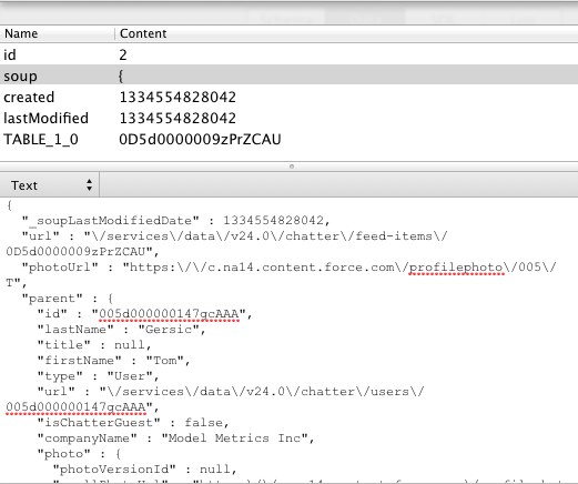
Once you log in, hit Query SFDC, and you see the Soup get registered, JSON data gets downloaded from the REST API and added to the SOUP. Take a look at the JSON data, and then hit the “Query SmartStore” button. You’ll see it load that same data from the SmartStore Soup and display it in the console log.
The Database
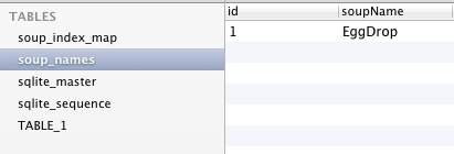
Let’s take a look at the actual SQLite database file and see how things are stored behind the scenes. You’ll see we have 3 tables in the database: soup_names, soup_index_map, and TABLE_1 (sqlite_master and sqlite_sequence are used internally by SQLite):

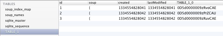
The Soup field contains the full JSON response for that record so you can reuse whatever code you wrote to deal with the JSON record from the REST API once you’ve pulled it from the Soup.
So that’s SmartStore. It’s a great way to put together an app for Salesforce, Database.com, or Chatter that stores JSON data on the device for offline access.
 Read More
One of the things added to Safari and UIWebView in iOS5 is support for XMLHttpRequest 2, which according to W3C adds new features “such as cross-origin requests, progress events, and the handling of byte streams for both sending and receiving”. As part of the last bit of that, it’s now possible to set the responseType to arraybuffer, which is “used to represent a generic, fixed-length binary data buffer”. More info here. This is useful if you want to download binary such as image or audio data from a remote location, and potentially manipulate it before presenting it to the user.
This has many possible applications for file transfer, but for instance, if you’re writing an HTML5 / PhoneGap app for iOS 5, and you want to download an attached file from the current version (v23.0) of the Chatter REST API, you need to send a GET request to:
https://test.salesforce.com/services/data/v23.0/chatter/files/[PUT THE FILE ID HERE]/content?versionNumber=1
But, you have to include a few headers for authentication…
setRequestHeader(“Authorization”, “OAuth ” + oauthToken);
setRequestHeader(‘X-User-Agent’, ‘salesforce-toolkit-rest-javascript/v23.0’);
…so it’s not like you can just dump the GET request into the src of an <img> tag. So, what you can do now in iOS 5 is send off an XMLHttpRequest with a responseType of “arraybuffer”, and use this data to write to a HTML5 Canvas object.
Here’s the XMLHttpRequest:
And here’s the body of the callback that handles Base64 encoding the arraybuffer and writing that data to a Canvas using the Data URI Scheme:
Read More